

Input validation is a critical component of any web application. It helps ensure that the data entered by users is accurate, complete, and meets the requirements of the application. Without proper input validation, applications can be vulnerable to security threats such as SQL injection and cross-site scripting (XSS) attacks. Input validation also improves the user experience by catching errors early on in the data entry process and providing clear, helpful error messages. This helps users understand what information is required and ensures that they provide accurate data, reducing the need for manual intervention and improving the overall efficiency of the application. In this article we will be focusing mainly on client side input validations and what a developer can do to create a safe and easy-to-use environment for their users.
Table of Contents
The Input Component
How to use the input component
React has a simple way of rendering various forms of input components within your web app and is defined by setting the ‘type’ property of the input component. A list browser supported input types can be found in MDN‘s documentation.
1 |
|

Using the correct type
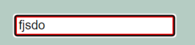
To some degree react’s input allows you to constrain the inputs to known values using semantic input types such as emails, phone numbers, and URLs. When a user makes an invalid input, such as a string without an ‘@’ sign in an email field, the style properties could change to indicate an invalid input.
1 |
|
Some types can even take it a step further by ensuring entering the wrong values is impossible. Example of this is a range slider.

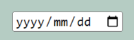
When the input needs to be of a specific format like dates, a mask will be provided.
It is also useful for hiding user inputs from onlookers by using the ‘password’ type which replaces characters’ visual feedback with dots.

Why is using the right type is important
Having the right type will not ensure protection against malicious agents, but it will help ensure the user has all the cues they need to enter the correct data in the correct fields and this data could be treated appropriately.
State management
Having interactive fields is only a small part of the process. This input data needs to be used later on, and this is where states come into play.
States are what describe the component and when states change, the components re-render and reflect these changes. An example would be in the previous example where the border styles changed as the input values (states) went from invalid to valid and vice-versa.
Controlled components vs Uncontrolled components
In the context of input validation, it is important to understand the difference between controlled and uncontrolled components. Controlled components are those where the value of the input field is controlled by the state of the component. This means that any changes made to the input field will result in the component’s state being updated, and the component will re-render to reflect these changes. On the other hand, uncontrolled components are those where the value of the input field is not controlled by the component’s state. Instead, the input field directly updates its own value and the component does not have any direct control over it.
In the context of input validation, it is typically recommended to use controlled components as they provide better control over the user’s input and make it easier to implement validation logic. With controlled components, you can easily check the value of the input field against a set of validation rules and display error messages as needed. On the other hand, with uncontrolled components, it is more difficult to implement validation logic as the component does not have direct control over the value of the input field.
Custom Input Validation
Custom input validation in React allows developers to enforce their own validation rules beyond what is automatically provided by the DOM and input types. This enhances the accuracy and validity of user inputs in a React based web application
For example, you might have a requirement that a password must contain at least 8 characters, including one uppercase letter, one lowercase letter, and one number. To implement this, you could write a custom validation function that takes the password input as an argument and returns an error message if the password does not meet the requirements. This function could then be called whenever the user inputs a password in your React component, and the error message could be displayed to the user.
Another example could be validating that an input field contains a valid URL. You can write a custom validation function to check if the URL is properly formatted and matches the expected pattern. This function could be called on the onChange event of the input field, and an error message could be displayed if the URL is invalid.
Custom input validation provides greater control over the data being entered by the user and helps ensure that the data is accurate and valid, which is crucial for the stability and security of your web application.
Understanding Regex Patterns
Regex simply refers to ‘Regular expressions’. These are common patterns in the text we regularly encounter on the web such as emails, user names, and passwords. We ensure text variables contain the right sequence of characters or adhere to particular rules by comparing those text variables to a regex pattern, similar to how the input types are validated by the DOM. RegexOne offers a great step by step explanation about the regex syntax and how it works.
You can learn more about regular expressions from MDN
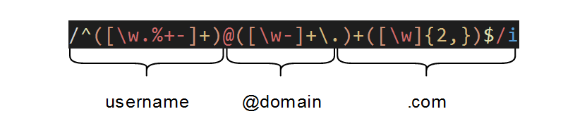
Let’s explore the regex pattern for an email some more:
1 | '/' = start and end of a regex pattern |
Keep in mind that matching emails in all specific use cases are not this simple and can in fact be much more complex. This is a complete version of the email regex. The example above will cover most use cases, but I urge you to study the syntax to ensure it suits your specific use case.
Error handling
When it comes to error handling, it is important to clearly indicate to the user what type of problem has occurred and how they could fix it. An exception to this is during the user login/authentication. When a password or email/username is incorrect, there should be no indication of which is wrong since this could be used to determine the existence of an account based on an email. For privacy and security reasons, during login, the error messages should be as arbitrary as possible.
Libraries
Although within certain development environments, such as companies with risk-averse or security-aware policies you typically shy away from libraries wherever feasibly possible, a library that manages input validations might be a more suitable option.
YUP and Fomik
YUP and Formik are popular libraries for input validation in React applications. Both libraries make it easier to handle and validate form data, making it more convenient for developers to create forms that meet the requirements of their applications.
YUP is a JavaScript object schema validation library that allows developers to define the shape and types of their form data. This makes it easy to validate data in real-time by providing a simple and intuitive API for defining validation rules. For example, a rule can be created to enforce that a specific field is required or that its value must match a certain pattern.
Formik, on the other hand, is a popular form handling library that helps developers create forms in React quickly and easily. Formik provides an intuitive way to manage form state and handle events, such as form submissions. One of its key features is its built-in support for YUP, which means that you can use YUP to validate your forms directly from within Formik.
To use YUP and Formik together, simply install both libraries and import them into your React component. Then, define your YUP schema and pass it to the Formik component. Formik will automatically use the schema to validate the form data whenever it changes. Additionally, you can use the YUP API to programmatically validate the form data and display error messages to the user.
In conclusion, YUP and Formik make it easier for developers to handle and validate form data in their React applications. By using these libraries, developers can create forms that are easy to maintain and have robust validation logic that ensures the data entered by users is accurate and meets the requirements of the application.
Visit YUP on GitHub and Formik on their website for more information.
Conclusion
Any form of input from the user introduces some risk factors, and it is vital to ensure the average user can feel safe and secure providing their information on your site and bad actors cannot breach the first layer of security wherever possible. If this interests you, and you want to learn more about all sorts of cyber security risks and how to counter them in your development journey, Web Security Academy provides just that. See you there!

Comments